Thursday, May 15, 2008

Design Guidelines for Touch Screen Interfaces

Touch screens are no longer a novelty interface in the field of human computer interaction. They have infiltrated consumer products as well as enterprise ones; they are used not only in mobile devices, but also the most stationary of devices. Due to direct manipulation, touch screens are independent of most of the tools we thought we could never part with: keyboard, mouse, stylus, etc.

However, this sacrifice does come with tradeoffs. Traditional keyboards provide tactile feedback and allow people to type at speeds much greater than touch screen keyboards. Mice move pointers at accelerated rates that mimic our own visual saccades; whereas with a touch screen interface, we are limited by having to traverse full physical distance with our hand.

These limitations are actually the result of, or rather the evidence of, the infancy of the touch screen interface. Once this specialized interface is optimized for our own cognitive and physical abilities and limitations, the touch screen interface may flourish. In this article, I attempt to provide guidelines taking into account some of the factors I have already mentioned.
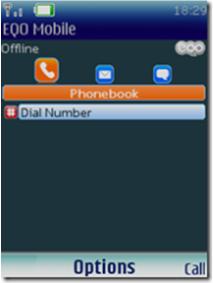
1. The Finger

Points of interaction must be large enough to be pushed by a finger. This is best done by a graphic-rich icon. There should be enough clearance on all sides to prevent accidental touches but at the same time the hot spot should be well placed. Precision should not be taken for granted, such as with mouse, point-and-click activities.

2. Text

Text should be used as a label and rarely, if ever, used as a hyperlink. Since touch screens are used up close, even closer than computer screens, text does not need to be significantly enlarged or magnified.

3. Information

These interfaces should solely be used for quick retrieval of bite-sized information easily accessible through efficient navigation. Devices that employ touch screens leave the user most often in an uncomfortable state (standing in front of a kiosk with neck bent, holding a mobile device in one hand while interacting with the device with the other hand). Due to these awkward positions, one should assume and design interfaces that do not afford reading long passages.

4. Navigation

Navigation and action buttons should be laid out in consistent areas of the screen. At the top level screens, designs can and should be more flexible and creative in style, placement, and size. In deeper level screens, navigation should be laid out on the top or side portions first with action buttons better suited to the left or center portions (depending on availability of screen space).


Labels: ,

Monday, April 7, 2008

Interview: Erik Hersman (WhiteAfrican.com)

Erik Hersman is the Cornucopia of compelling Africa-oriented web content. He has offered insightful anecdotes and perspectives on the place "where Africa and technology collide" for years (quote from Erik's blog).

He has experience in Web strategy as a technologist, and experience with the juxtaposition of "developed" and "developing" regions--as a past or present resident in both.

This combination makes him an ideal spokesman for The UI Thread's ongoing inquiry into the 'how' and 'why' of Bespoke UI for Developing Regions.

Erik was kind enough to answer our questions over email, offering a tenured voice and interesting perspective.

Interview with Erik Hersman

UIT - The topic has to do with the current state of affairs of 'home grown' User
Interfaces for Africa. Everyone knows there's lots of hype around mobile these
days...but there are surprisingly few stories about local African innovation
with mobile systems.

We are trying to assess the need for more attention being given to 'home grown' solutions. E.g., are 'Western' systems sufficient for the largest anticipated user base in the world??

We've read some discussions on your blog about a similar topic (i.e. web
development coming out of Africa).

As a Web Technologist, how do you cope with the fact that less than 4% of Africans have Internet access?

Erik - I see this as a starting point. It’s not as if that percentage is ever going to decrease, we’ll continue to see greater adoption. We have to think of the future with a long-term perspective on integration into everyday African’s lives.

We also have to weigh the value of traditional computer-based internet access versus mobile forms. As more developers think creatively on how to get information and data to the mass amounts of mobile users in Africa, the need for internet access via computer will decrease for certain functions. I think there is a huge area of growth that is lying virtually untapped in the mobile market right now.

At the same time, I think we need to distance ourselves from the thought process of mobile versus PC. We’re basically talking about data flow and personal interactivity. Creating applications and services that work equally well on both platforms is where we should be placing our focus.

UIT - Who is better suited to develop interactive systems for Africa: Africans or non-Africans? Why?

Erik - Africans generally speaking, or if non-Africans, then ones that have lived significantly long enough in Africa so that they can understand the cultural nuances. This goes across Africa too, there’s no one “right way” for all of Africa. It’s too diverse.

Though there are many features and standardized practices found around the world, I still wouldn’t expect to see too many of the top web apps in the US built by people not from the US. This applies to Africa as well. Indigenous people, whether in Europe, the US or Africa, have a better handle on their culture and what types of services and features are needed.

UIT - Do you think "Western" developed software should be localized for African users beyond language, or is translation enough? (E.g. McDonald's doesn't only simply translate their menu, they adapt their food offerings to be culturally sensitive.)

Erik - It looks like I jumped ahead and answered this question in the one above. Basically, translation is not enough. There are certain platform features that can be standardized across cultures, but thought has to be given to cultural norms and sensitivities when the detail work is being put into an application.

UIT - When do you think Africans will shift from primarily SMS based systems to richer interactivity offered by e.g. Java or mobile web browsers?

Erik - Interesting question, and one that I’ve been thinking a lot about lately. I don’t have a source to back it up, but I was at a conference this summer in Kenya where a couple people mentioned that the penetration of Java enabled mobile phones in Africa was around 30%.

That’s not critical mass by any means, but I believe it’s a trend. We’ll continue to see the use of SMS as the primary means of communication, but as more companies build rich Java applications that are actually useful and save people time and/or money, the number of adopters will increase.

So, if I’m making a mobile phone application for Africa starting today, I would seriously think about making it a Java app.

However, something that needs to be discussed is the level of service and bandwidth capabilities for data on the mobile phone networks right now. In some countries there are some serious limitations in that area.

UIT - Given unlimited resources, which single technology would you deploy alongside or within mobile phones and why?

Erik - This is the part where I get to dream right?  Okay, I would build a Java-based application that decreases communication costs and provides for greater interactivity than is generally available through SMS-only phones. I would likely use an open-source solution that allows for lower cost initial outlay and scalability.

UIT - Which features on your current mobile phone would likely need adaptations if to be used by the "masses" in, e.g., Nairobi, Kenya?

Erik - I use an iPhone, so that’s a bit harder to answer. It doesn’t have some of the features that I’d really like it to have, like the ability to load 3rd party applications.

UIT - What are the 3 biggest road blocks encountered when trying to innovate from a typical developer or designer in Africa?

Erik -
  • Funding – everything tends to be done out of the developers pockets on their own time. Few non-Africans will fund any African technology initiative, incorrectly thinking that it’s too risky and that it wouldn’t make enough money. Too few wealthy Africans will fund projects like this either, or if they do, the developer is left with no meaningful equity.
  • “Old Boys Club” – young innovators come along all the time. Many of them smash into the opposition of some entrenched bureaucrat or Big Co. executive who knows the right people and squashes the innovation. Or, more likely, the big company ends up stealing the idea and making the money while the young innovator gets nothing.
  • Bandwidth – as more and more development projects deal with data flowing across the web and mobile networks, there is a real need to increase the bandwidth provided in most African countries. Any real popular mobile phone application that requires data to flow constantly could quickly run up against a bandwidth wall that is not quickly overcome.
UIT - How do you think developers, designers, etc., can best help non-literate "users" of ICT in Africa?

Erik - For any text-based application on a mobile phone, you have to have some type of literacy. As user-friendly as you can make the device’s interface, people still need to be able to communicate using it. If they’re communicating primarily via text, then a basic requirement is that they need to be able to read at a certain level.

However, there are still some ways around the traditional text user-interface that could be done. Use of icons and voice could open up some communications areas that allow a broader audience to participate.

Follow-up message from UIT:

We thank Erik for shedding light on the under-explored domain of interactive systems in Africa. We appreciate Erik's sensitivity to segmentation within the African market. Africa is hugely diverse, and different people will find different information useful through different delivery mechanisms. This will definitely drive innovation in delivering culturally and regionally accessible information services and applications.

The UI Thread team has synthesized a simple Venn diagram illustrating an important concept of technology harmonization. Such harmonization, when developing services and applications for Emerging Markets, is critical to mobile information accessibility. The UI Thread will introduce more thoughts on harmonization later, but for now, here's the simple Venn diagram:


For more on Erik Hersman, the Cornucopia of compelling content, we highly recommend you visit whiteafrican.com or afrigadget.com or any other one of Erik Hersman's other sites.


Labels: , ,

Thursday, February 14, 2008

Don't make elevators into Jerks!


I just stumbled onto a blog written by a fellow named David Louis Edelman by way of a three-part article that caught my eye called ‘Building the Perfect Interface’. From Edelman:
"Take the standard elevator. Elevators are extremely dumb machines. They spend large amounts of time sitting on the wrong floor. When you walk up to the elevator, the only interface you’ve got is a simple two-button panel that asks whether you’re going up or down. People often end up piling into multiple elevators that are going to the same destinations, requiring all of the elevators to stop at multiple floors. The buttons for opening and closing the doors once you’re in there are a bad joke — by the time you find them, it’s either too late to stop the doors or just an unnecessary extra redundancy.

How come the elevators don’t know where you’re going already? If you’re in a strange building, that’s understandable — but why should you have to push the same button for your apartment or office every day? Couldn’t the building automatically sense that someone’s waiting for the elevator via motion detectors? And couldn’t it automatically sense which floor you’re heading to by reading an RFID chip in your key? Hell, the elevator should start making decisions about which elevator to send and when as soon as I enter the parking garage."

David Louis Edelman brings up some very good points and some very bad ones here in the same breath. I think it’s helpful for us interface designers to recognize the well-supported insights offered by enthusiasts (Edelman himself is a programmer and a novelist- not a user interface designer), while at the same time being able to quickly point out areas of caution.

Elevators are indeed extremely dumb machines. They are like traffic lights in that they don’t make use of much intelligence, and people generally accept the way they are because they use them so often and really only pay any attention to them when they behave particularly poorly.

However, the author treads into dangerous territory when he suggests that elevators should not force us to make decisions and tell it where to go every day- that the elevator should be the one that makes the decisions. After all, the technology is available for the elevators to be smart enough to do this for us, right?

Right…if you’re one of those kinds of people whom enjoy being predictable and having no say in where your body is moved about through this physical world of ours.

The truth is, people like not having to worry about the small stuff. But in order for the small stuff to be completely accounted for by technology, it needs to be done very well- and account for exceptions. The elevator that ‘knows’ where you want to go and takes you there automatically is very presumptuous- almost a bit rude. Although it might seem great at first that you are forever free from pressing that damn button every damn day (which can be disburdened many other ways), you will quickly change your mind about it the one time you carelessly decide to leave your apartment to head up to you’re friend’s place on the 14th floor and the elevator smugly guides you to your car in the basement. Was it your fault you didn’t let the elevator know ahead of time to divert from the usual path? Now we’ve introduced another set of stuff you have to worry about…Wasn’t the point to rid yourself of effort and thought?!

I think at this point in time, we really need to concern ourselves with aiding people’s decision making skills, and not making decisions for them. And when I say decisions, I mean larger and personal ones like where to go, and not teensy or impersonal ones like organizing your online movie library into genre taxonomies. After all, people like to make decisions about things that are important to them. Control is desirable.

The elevator should be smart enough to know all sorts of information about our usage patterns, where we live or work in the building (as long as we want it to know that!), and what floors we are probably going to be visiting given the day and time…However, this information needs to be used to do things like prepare and suggest- not to assume and decide. That’s our job! It reminds me of some of the points made by Don Norman in his latest book, “The Design of Future Things”. To be honest, I wasn’t a big fan of the book in light of his other big sellers, but it did offer sound advice on people trying to design the next wave of intelligent products and services.

All in all, Edelman did have some good ideas. I do think it would be handy for an elevator to be present (or quickly on its way) depending on when you’ve arrived and gotten out of your car. But I think things like emphasizing floors by remembering the person’s previous decisions and/or their RFID info might be more helpful rather than kidnapping them and taking them there without asking first. These, in addition to improving the interface by way of adhering to proper design principles of proximity and cognitive load, would be a huge improvement. Of course some caveats that would still need to be worked out though:
  1. How do we make decisions about what we want the elevator to know about us?
  2. How do we handle multiple people in one elevator with conflicting goals, locations, and privacy preferences?
  3. How do we design these so-called intelligent elevators differently depending on whether the users are frequent or infrequent (e.g. office buildings vs. hotels)?
In conclusion, I’d like to leave off with this sentiment; half of the time, I don’t even know what I want. So, how could a machine? We should encourage caution when allowing machines to pretend they really do…at least for the next few decades…right?

Sunday, January 27, 2008

Interview: Erik Pukinskis (OLPC, AbiWord)

Erik Pukinskis is currently a PhD student in the Distributed Cognition and Human-Computer Interaction Lab in the Cognitive Science department at the University of California in San Diego.

He previously had an opportunity to work on the interface of an ambitious project: One Laptop Per Child (OLPC).

His focus was on re-working the user interface of the open-source word processor, AbiWord, with the tagline, "Word Processing for Everyone."

"Write" was the derivative application, aimed at introducing school children in developing regions to perhaps their first-ever word processing experience.

Interview with Erik Pukinskis

UIT - Hi Erik.

The UI Thread is most interested in your experiences relating to the challenges you faced re-designing a UI for such a diverse group of users.

AbiWord is an AbiSource project known for its cross-platform functionality, portability and localization potential. In you opinion, why was AbiWord the best editor for the job?

Erik - I don't know all of the reasons why OLPC chose AbiWord, but I can make some guesses. It's small and light, which is important given the XO has very little storage space and processing power. I think there was already some inertia towards using GTK for OLPC software. And RedHat was doing the software, and their engineers are very familiar with GNOME technologies.

UIT - How well do you think AbiWord would have served the needs of the target-users had no thought been given to re-designing the UI?

Erik - You know, I wonder about this. A lot of work is going into redesigning these apps for what we think the target kids will need, but no one is really researching how the kids live, and even if they did, no one can predict what they'll do with the machines. Sometimes I think they should just throw Ubuntu on there and let the kids figure it out. Children are just bursting with ingenuity.

That said, there's great potential for harm. The laptops might cause serious social problems. It's just impossible to predict. As my friend Lilly smartly asked, "Could it be the new skolt lapp parable?"

UIT - How did you go about discovering and defining your individual target-user groups?

Erik - I basically read the press releases coming out of OLPC and RedHat and everyone, and then I pecked at Chris Blizzard for as many details about the rollout plan as I could.

UIT - The target-users you were designing for were very far away, and very dispersed. How did you address that challenge and inform your design with useful data?

Erik - I went to people who know more than me. I got some good guidance from a professor of mine, Eden Medina, who has has a lot of knowledge about South America. And I interviewed professors at the University I was at (Indiana University) who were knowledgeable about Brazil and Nigeria and other launch countries and had visited or lived in those countries.

It was really wonderful, talking to people who could say "this is what school is like for these kids" and who knew, because they had been there and lived it.

UIT - What were the top 5 design modifications needed for AbiWord?

Erik - It's hard to say what was "needed". I had some ideas of what I thought would be a good place to start... making it usable by people who can't read was a big one. Getting it to work on a small screen was another one. Trying to make it engaging for kids was probably a third. As for four and five... well, you can only have so many design goals. :)

UIT - Can you tell us about any opportunities you had for user research or user testing before, during, or after the design process?

Erik - I'm sort of embarrassed to say it, but I didn't do any user testing! It's not easy getting access to kids to do user testing. And I was traveling while working that summer, so I was mostly limited to desk work.

UIT - Given you experience with OLPC, what would you recommend to a UI designer embarking on a multi-national UI design for developing regions?

Erik - If I were doing it, I'd try to get volunteers from lots of different countries who know what the target environment is like, and can do user testing. If you do iterative design with a team like that, I'd think a good result would be almost inevitable.

UIT - The Sugar UI is very unique. How did it influence you during your design process?

Erik - I spent a good deal of time just figuring out how to conform to their design ideas, which was a little different than previous design projects. In school, you have massive amounts of freedom, and you're trying to design something very forward-looking. In this case, I was just trying to help AbiWord fit in.

UIT - Which aspects of your background and education do you felt you drew on most while working on the re-design?

Erik - My skills in user research and prototyping from design school came in useful. And I certainly had to draw on programming experience from my Computer Science undergraduate days.

UIT - Overall, how did you find the project and what would you do differently given the chance?

Erik - It was a great project! I don't think I'd do anything differently if I could go back, because that was who I was, and I like who I am now... but if I were to do a similar project again, I would focus much more on working with children. I'd make finding children for user testing my first priority and try to do iterative design with them. Iterations make the world go round.

UIT - Our compliments to you for working on such an interesting project! Thanks again for your time.

Erik - Thanks for your interest!

Follow-up message from UIT:

Erik's suggestion of engaging end-users more for future projects is a wonderful idea. Sometimes this can cost a lot of money and Free/Open Source Software projects usually don't have a lot.

However, creative designers should be able to find affordable means. In fact, something tells us children would participate for lollipops.

We at the UI Thread care a great deal for F/OSS in general--especially projects aimed at bridging the so-called "Digital Divide." However, despite the best of intentions, it seems that Open Source initiatives are still lagging behind private-market firms when it comes to enunciating the mantras of user-centered design.

Hopefully with more people like Erik Pukinskis getting involved, this will change. After all, F/OSS is about community design and development. Projects such as Ubuntu seem to be on the right track.

"Ubuntu is an African word meaning 'Humanity to others', or 'I am what I am because of who we all are'. The Ubuntu distribution brings the spirit of Ubuntu to the software world." - (ubuntu.com)

So we at The UI Thread put forth a call to action for those wishing to develop interactive-systems on shoe-string budgets:

Embody "OpenUCD." Find ways to follow UCD methodologies the best you can.

Ask for help if you feel you need it.
(e.g. http://groups.google.com/group/openucd)

For more on Erik Pukinskis' initiatives, visit his blog SnowedIn.net.


Labels: , ,

Thursday, December 6, 2007

Why Goals and Tasks are the Same Thing (part 3)


In Part 1 of this long post series, I discussed goal-directed design and the more customary way to view goals and tasks, along with their commonly noted distinctions. In Part 2, I laid down my claim about the true nature behind these conceptual tools, in attempt to both confuse the matter and also clarify it at the same time.

In Part 3, presumably the final part, I will attempt to address the implications drawn from my claim, supposing how we may use my rants to further us in our ways of general hierarchical thinking and in our more specific instances of user-centered design methodology.

I'd like to note that the main conclusions in the claim and resulting discussion lie mostly in the realm of communicating about goals and tasks effectively with team members, as well as thinking about them for yourself. In other words, I am not advocating full-blown changes to the way you acquire and analyze user data or even necessarily in the way you design goal-directed solution.


My aim is to get you to think and communicate with flexibility about user modeling.


I've heard of (and been part of) many squabbles in the confines of meeting rooms where UCD professionals are forced to argue over what constitutes a goal and what constitutes a task in order to establish a common ground of discussion and documentation. And establishing these common grounds is so important to effect collaboration- whether you are a 2 person team or a multi-departmental corporation. The thing is; these types of arguments will always plague the said team time and time again because the division between the two concepts is not prescriptive. Thus, they will have to revisit the same argument every time, albeit with different activities in question.

It's like having to compromise (and often disagree) on rules for a pickup football game every single time you play (even though it's the same group of people). If you could all agree on the basic nature of the game in the first place, then you could establish any rules you want and follow them to your heart's content- as long as you are all happy with how the game is being played.

Similarly, instead of discussing whether or not changing the music in the car is a goal or a task, and then having to have the same discussion about finding a destination on a dashboard navigation system, you should just realize that you are wasting your time and efforts! By putting your time into establishing a more flexible and effective process, with a basic underlying acceptance of the continuous nature of goals and tasks, you can be more effective.

If you can accept the claim that tasks and goals (and other variants of the terms, like activities, objectives, etc.) are really inherently the same concept and differ only in their relativity and global scope, then you will be able to appreciate some consequential implications:
  1. Your team communication and process establishment will potentially benefit.
  2. You can easily increase and decrease your scope of attention by simply asking why and how, respectively.
  3. You can realize that just because a goal is 'higher' doesn't always mean that it is more important than a task. If you design a product or service that behaves abhorrently at lower levels (say, the visual feedback of button pressing, or a customer service interaction), then the goal no longer matters to the user experience! After all, a person may never even be cognizant of a high level goal if they are immerse in an appropriately scaled task. See Flow Theory.
  4. The methods you use to identify goals can be employed to identify tasks as well- and vice versa. So, if you have an established way of recognizing people's tasks in an observed workflow, but need to identify their subtasks and/or goals for accomplishing the tasks you find, you don't have to use a different process.
  5. It's all about finding the sweet spot. Using a flexible goal/task diagram technique, you can quickly identify the top boundary (when the user no longer knows or cares why they do something) and the bottom boundary (when the user no longer cares or knows how they do it). Identifying the boundaries can be very powerful for understanding exactly what level of scope your product should cater to and how to go about planning your UCD project.
  6. Actor goals found in use cases are not a different kind of goal from the ones found in goal/task hierarchies created by UCD proffesionals. They are just usually lower is scope than the goals found typical hierarchies (the ones that specify why the use cases are being accomplished in the first place).
  7. Lastly, goal/task hierarchies and the concepts they represent are NOT prescriptive. They are descriptive guidelines, imperfect by nature, and requiring the interpretation and discussion of qualified professionals.
As my boss put it after a long discussion, goal/task diagrams are kind of like research heuristics, in parallel with design heuristics. They are malleable guidelines that you can use to research users and hopefully design useful and usable solutions.

Labels:

Tuesday, November 20, 2007

Interview: Ken Banks (FrontlineSMS)

The Friday, 20 April 2007 BBC News headline read:

"Texts monitor Nigerian elections"

"Anyone trying to rig or tamper with Saturday's presidential elections in Nigeria could be caught out by a team of volunteers armed with mobile phones."

"NMEM is using a free system called Frontline SMS, developed by programmer Ken Banks, to keep track of all of the texts." (source)

We at The UI Thread came across Ken's story, and FrontlineSMS, at ShareIdeas.org. (The website is dedicated to 'positive' uses of mobile technology.)

After learning more about Ken's application--which has enabled numerous organizations' communicative robustness--we took an opportunity to inquire about its history and User Interface.


Ken was kind enough to engage in an email-based interview over a period of a couple of weeks. (We hope to talk in person some time!)

Interview with Ken Banks
:

UIT - How are people finding out about this application and how to use it?

Ken - "When FrontlineSMS was released to the world towards the end of 2005, I had no marketing plan (or experience), and hardly any contacts who could help promote it (and no money). So initially it was just graft getting it discussed on news sites and blogs. One of the breakthrough contacts was Mike Grenville at 160Characters, who put news of its release in his newsletter (it is widely distributed). Other than that, news about the software has been entirely viral. I must confess to being a pain in the butt (but in a proactive way!) by not letting a single opportunity go by where I felt I could shout about it. It’s now been picked up and reported on in a number of reports (such as the MobileActive series), another time in a Gates Foundation report, and more recently in an as-yet unpublished paper from Acumen Fund. There are actually more Google hits for “FrontlineSMS” than there are for “kiwanja.net”, which is interesting. In terms of finding out how to use it, the website is clear on set up and configuration issues (the fact I get so few technical support questions is proof to me of how clear it is). The software has a built-in HTML help system, but it’s intuitive enough, I believe, for most people to be able to start using it quite quickly. The screens generally have a ‘flow’ about them, and being a user myself, and having spent a lot of time with colleagues in developing countries and knowing a little bit about how they got on with computers (I trained some of the Nigerian staff while I was working at a primate sanctuary there – two years before I wrote FrontlineSMS). Again, I have not heard of any issues in usability"


UIT - How do people perceive FrontlineSMS in terms of a new system they weren't exposed to?

Ken - "FrontlineSMS has been received so incredibly well I think in part down to the project’s aims and objectives, and the overall work ethic (i.e. trying to empower, not dictate, and free software and free support, and a genuine interest in the work of non-profits and what they’re trying to achieve, and experience working where they work in many cases). I think this, above everything, has been a major factor in the contacts I’ve been getting, and the requests to use the software. The general vibe of the project stands above the software itself, in a way (does that make sense?). So, when users get hold of FrontlineSMS they are already excited and captivated by it. I get numerous mails telling me how great it is and thanking me for developing it BEFORE the users even get to use it. So, when they are finally exposed to it I think they’re just grateful for it being there for them, and none have made any critical comments or suggestions on how it can be improved. This may be in part to their lack of knowing what to expect. Also, mobile is such an exciting area for most people, many are just grateful for being able to do something in the space"


UIT - In terms of FrontlineSMS usage for the Nigerian elections, which environmental conditions made FrontlineSMS an attractive choice for users?


Ken - "I think, for the Nigerians, it was attractive because it was “written for them” in the sense of the NGO approach (so there were no concerns about being taken for a ride financially), and that it’s use in developing countries has been widely reported. It was also quite likely the only solution out there for them (I don’t know of anything else which quite does was FrontlineSMS does, although I may be wrong). The Nigerians had a minimal budget, little experience of setting up a telecoms service, and little time. They wouldn’t have known how to deal with their local operators to get short codes, for example, and there would have been big time and cost implications for them. Also, having the software run on a local machine, rather than being web-based, meant that they had a sense of “ownership” of it, I suspect. You know, it’s their system and their data and their effort. I think that, more widely speaking, this sense of ownership is a key element in ICT software development when you talk about it in a developing country context. At the end of the day, I think people just “get” FrontlineSMS – you know, the whole thing about putting software on THAT laptop and then connecting A phone to it. It’s a very visual solution"


UIT - What were the alternatives to completing the task FrontlineSMS was used for in Nigeria?


Ken - "As I mentioned, I don’t think there’s really much else out there. The NMEM team could have maybe gone to an operator and tried to get a deal with an access number, or a short code or something. They could have also perhaps just tried to use a smarter phone, and tried to save the messages somewhere (this would have been difficult with 10,000+ replies). They may have also looked at some of the commercial systems out there. I think their situation conspired against them in all these cases – particularly in terms of the technical and financial challenges it would have created"


UIT - When designing FrontlineSMS, how did you explore cultural and regional considerations for the User Interface (e.g. if you knew many people in developing regions would be using it)?


Ken - "In short, I didn't have time to do any of that. I've developed a number of systems before, and generally have a good grasp of what users like and don't like. So FrontlineSMS has no hugely thought-out UI design, although I have received positive comments on the whole, and no-one has experienced problems in using it. 2.0 will have multi-language support"


UIT - In general, how did you go about designing the User Interface? ( E.g. did you apply any design heuristics, usability methods or leverage any ethnographic data?)


Ken - "As mentioned above, I didn't plan it too much. I only had 5 weeks to develop it, so there wasn't a lot of lead time. I'd be interested in hearing your thoughts, though! =) "


UIT - Will the forthcoming version of FrontlineSMS include any substantial changes at the GUI level, or user interactions? If so, what elicited the changes?


Ken - "I do not anticipate too many changes in the UI in the new version, since there doesn’t seem to be a call for any. A couple of things I have picked up on need doing, such as moving the phone settings from a main screen into a menu somewhere, but there really isn’t much. To be honest, a lot of the current screen design only turned out the way it did because it was the only way I could make everything fit. In the first version I wanted to give the user everything they needed at once, rather than expect them to find a configuration menu somewhere else. From my experience of users in developing countries, not being able to configure the phone, for example, on the same screen as the messages are sent, would be counter-intuitive. The screens are being built in the new version in such a way that they can be changed easily – the open source community will be free to do any of this – and the screen text will be held in central files to allow for the support of multiple languages in the future"


UIT - SMS is the killer app in Africa. When will that change?


Ken - "The Mobile Web will probably change that, but SMS will always have a place in the mobile universe. Handsets in developing countries – rural areas in particular - won't be able to handle anything other than SMS as data for another few years, is my guess. Read my http://www.blogspot.kiwanja.net/2007/09/digital-divider.html for a better review"


UIT - Why will that change?


Ken - "SMS has obvious limitations (message length, literacy issues, cost – it's very expensive if you think about the actual amount of data being sent). There are others but I'll need to think a little more…"


Follow-up message from UIT:

As UI-oriented people, we're obligated to hold UI methodologies in high esteem. However, UI design is not simply GUI design--a common oversight.

Effective UI designers know the importance of User-Centered Design (UCD) and wouldn't be worth their screen-flows without it.

Ken Banks and FrontlineSMS exist in the exciting and evolving domain of social-driven mobile applications. (We've coined an aspect of this domain "OpenUCD" which identifies a need for User-Centered Design in F/OSS, as much as the practice of it.)

FrontlineSMS goes beyond effective GUI because it, as an interactive system, is backed by substantial user research, understanding and a consumer-targeted approach. Evidenced by Ken's responses to our questions, this mobile interactive system is a product of ad-hoc ethnography as much as rapid-prototyping.


In fact, perhaps without realizing it, Ken has done a commendable job at UCD by making UI choices in response to actual user needs. For that he has been rewarded (by the rapid uptake of his application).

Our praise of Ken's work, however, is balanced by the recognition that many social-oriented projects may not have the good fortune of in-depth user research or domain expertise.

So we at The UI Thread put forth a call to action for those wishing to develop interactive-systems on shoe-string budgets:

Embody "OpenUCD." Find ways to follow UCD methodologies the best you can.

Ask for help if you feel you need it.
(e.g. http://groups.google.com/group/openucd)

For more on Ken Banks
' initiatives, and FrontlineSMS, please visit Ken's website Kiwanja.net.

Learn about his background and experiences at this ShareIdeas.org Webinar.

Thanks Ken!

- UIT

Labels: , ,

Friday, November 16, 2007

A Scientific Method of Designing

  1. Finding Need in the Market
  2. Targeting a Customer Segment
  3. Identifying Use Cases of Ideal Solution
  4. Prioritizing via Functional Limitations 
  5. Creating an Information Architecture
  6. Modularize Layout of UI
  7. Designing Efficiency of Interaction

Let me cut you off right there. You are correct. There is no hard science behind design. However without some framework, design is downright impossible. Let’s leverage the best practices of business, engineering, and visual arts to deliver the richest experience to our end-user.

A Seemingly Useless Epiphany

People need a place to live.

   Let’s face it. We encounter so many problems every day. Technology hasn’t made us less stressed or happy; rather, it has given us higher expectations of what the world should deliver. Lucky for us designers, technology only creates more opportunities for innovation. There is no shortage of problems and neither is there a shortage of ideas. Thus, finding a need in the market is really a matter of identifying a single group of issues that can be met with an innovative, elegant solution from technology.

A Need in the Market

People need to be able to find a place to live.

   More than likely, you’ll find almost everyone can benefit to a solution to the problems you encountered. Well due to evolution or some higher power, we are not all created equal but somehow we fit into nice groups we can call demographics. Each demographic has it’s own constraints, whether financially, technically, or even accessibly. By “discriminating,” you now have the ability to target a niche. Thus you have the upper hand to compromise less and deliver the highest utility to the select rather than compromise completely and deliver a lower utility to everyone. All in all, your goal is to compromise the least in order to provide that rich experience to as many users as possible.

A Customer Segment

American technical 20-somethings need to be able to find a place to live.

   Now it’s time to think big. You must identify all the circumstances and objectives you can satisfy with your innovation. By targeting a customer segment, you have the ability to cater to their needs and wants. At this point, you should not get bogged down in the details but instead identify objectives, features, and other consumer-friendly uses of your ideal solution. Remember, for each problem you solve, consumers will want to reach that solution more efficiently and effectively.

Use Cases of an Ideal Solution

These people want to be able to access an online tool 
to find a place to live optimized for their 
finances, activities, locations, fun, and overall happiness.

   Then, it hits you. You remember you’re still living in the blossoming present, not the rosy future. (Municipal Wi-Fi is still five years away like it was five years ago.) The use cases you identified are what your target customer wants. Since you have a target customer, his or her use cases are not a result of any compromise yet. Instead, you have the ability to prioritize the use cases based on functional limitations. Not everything can be done with the technology of today. However by prioritizing what you know what you can deliver today, you have essentially identified what you may be able to better deliver tomorrow. By now you have created a matrix of use cases, ordered by importance to the user coupled with the roadmap of when you can deliver on those solutions.

Prioritizing via Functional Limitations

There is no measure of happiness but there is a measure of finances 
e.g. personal online banking information.

   With a fixed set of use cases, you can figure out the most efficient paths for users to achieve their end result. By crawling into the mind of our target user, we can trace the steps he or she would take. Many of the use cases will have common steps and lead toward a complex web of information. By creating a hierarchy of these steps and connecting commonalities, information architecture will follow.

Information Architecture from Prioritized Use Cases

Housing > Finances > What I can afford > With Loans > With Interest
vs
Housing > What I can afford (with loans with interest)

   Here’s the tricky part. A path for a common use case may have a long series of steps. If you were to directly map the information architecture into a hierarchy-based UI, your user would be very inefficient in achieving this task. One solution is to minimize this issue, by providing a “shortcut” to this action (or actions via a group). Each of these shortcuts take away from the organized structure you tried to map from your information architecture. However, these shortcuts are a necessary evil. By modularizing your UI, you can properly distinguish your shortcuts (and groups of shortcuts) from your hierarchy to help users gain quick access to solutions to common use cases while at the same time providing a logical path to other solutions.

Modularization of the UI

Hierarchy: Optimize finance, Optimize activities, Optimize distance
Shortcuts: Automatically optimize everything based on my online information

   Just by segmenting the layout of the UI, the interaction does not automatically become optimized for efficiency. This is where usability and benchmarking takes place. Obviously, we are not the target customers so we should not take our own wisdom as the final say. Getting target users involved early in the process leads to more user-centered design. This prevents usability “fixes” and supports an elegant solution from the beginning.


Each of these six topics may deserve their own blog post but at the same time, it is necessary to have a general yet clearer idea of the issues that must be considered in design. By communicating a process, I hope to initiate discussion of the larger topics that fit into each step. This framework may be referenced in future threads as a starting point for further discussion. 

Labels:

Wednesday, October 31, 2007

Why Goals and Tasks are the Same Thing (part 2)

In Part 1 of this post series, I discussed goal-directed design and the more customary way to view goals and tasks, along with their distinctions. In Part 2, I will lay down my claim about the true nature behind these conceptual tools. And in Part 3, the final part, I attempt to address the implications drawn from my claim, supposing how we may use my rants to further us in our ways of general thinking and in our more specific instances of user-centered design methodology.

To continue my discussion, I'll get the ball rolling with my slightly blunt contention- which is; the only difference between what constitutes a goal and what constitutes a task is the relationship between two. To put it another way, Albert Einstein was right when he said it was all relative- it all depends on how you look at the goal or task in question.

In Part 1, I listed out several typical assumptions about the differences between goals and tasks. Here, I will list them again and provide perhaps some more clarifying rebuttals to the statements.

  1. Goals are high-level; Tasks are low-level.
    While globally true, this is more of a descriptive and subjective accusation and is not objectively prescriptive for labeling across multiple goal/task analyses.
  1. Goals are abstract; Tasks are physically observable (concrete).
    This is a tough one- after all it is a pretty easy way to think about it. However, it requires a vigorous exploration into what it means to be abstract in order to see that abstraction is extremely difficult to classify and most likely exists as some type of graded continuum- not an either/or. But I’ll save the philosophy for a different time and place! Often times, tasks are fully or partially abstract as well. And sometimes sub-tasks are not fully observable.


  2. Goals are something a user has; Tasks are something a user does.
    This is simply a property of the terminology you are using. Only once you call something a goal does it make sense for you to “have” it, as opposed to “doing” it. Once again, it is not a prescriptive way to deal with entities which could be called either tasks or goals.


  3. Goals do not change; Tasks do change.
    This is simply not true. It’s a close approximation, but fatally false. Goals do in fact change. The difference is that high level goals change MUCH more slowly and less frequently than do low level tasks. Once you understand the continuous scoping nature of goal/task hierarchies, it will be easy to see that statement number 4 is an oversimplification.


If you don't remember my common goal/task diagram example from Part 1, now would be a good time to reference it. Let's take a look at my revised goal/task diagram:


Now, allow me to make some claims about goals and tasks that I think are better suited for accuracy which follow from the above diagram:


Goals and Tasks aren't qualitatively distinct.
Give me a task and I'll show you how it's really a goal for another set of subtasks. Conversely, you can provide me with a goal, and I'll show you that it's really a task that exists to reaching some higher-yet goal. The thing that makes the two different is the state in which you view it relevant to another. At any one point in time, the entity under inspection could be a goal or a task depending on how you view it.

Goals and Tasks are relevant to each other.
A task is only a task if it is subordinate to a goal. Likewise, a goal can only be considered a goal if it is composed of one or more tasks. Otherwise, it too is just a task...Another way to put this is that if a goal doesn't have a reason for being accomplished or desired that satisfies some lower steps to get there, then it doesn't have the right to be called a goal.

Goals and Tasks can be mapped onto a continuum.
Create a goal/task diagram that extends as many hierarchical levels as you'd like. Now, recognize that you cannot draw any straight line that separates concrete physical tasks from abstract ones. Instead of creating false categories, it is more accurate to map them onto a continuum where at the top lie MORE abstract, higher-level, slowly changing goals and where at the bottom lie MORE concrete, lower-level, often-changing tasks.

Goals and Tasks change over time, albeit at different rates.
While tasks at lower levels can change very quickly and often, higher level goals can change very slowly or seemingly not at all. Think about it- while you may always have the semi-constant goal of getting your coffee in the morning, the way in which you go about getting your coffee may vary from making it yourself, to your loved one making it, to going to a coffee shop on the wya to work, to grabbing some at work. While I may at age 40 decide that coffee is no longer my drink of choice due to stomach ulcers or some sleep somnia, my lower level tasks that lead to my acquiring coffee change much more rapidly (every other day compared to almost 20 years from now).

Ask WHY to traverse to a Goal, and ask HOW to see it's respective task(s).
At any node in a goal/task hierarchy, one may ask why it is being performed. The answer you get is a goal or a set of goals. Likewise, if you ask how a particular node is performed, the answer you get is a task or set of tasks. This is actually pretty basic, but the cool thing is that you can ask these questions for ANY node in a goal.task hierarchy! In fact, once you apply this practice to a range of nodes in a hierarchy, it really becomes clear that goals and nodes are really only relative terms.

Another cool thing is that these questions act as arbiters for the top and bottom boundaries of a goal/task diagram. It is at the point when one no longer cares why or knows why that the top of the boundary is fully identified. Alternatively, when one no longer knows how a task is performed, or cares how it is performed, we see the bottom boundary.


If you feel my claim is misguided, ridiculously time-wasting, or just plain wrong, please feel free to comment and explain your side. Otherwise, please ponder the argument above. I hope to explain the usefulness from these points in my next post, along with some interesting implications that they draw.


Until Part 3...

Labels:

Thursday, October 18, 2007

Bespoke UI for Developing Regions?


The continent of Africa is experiencing an unprecedented growth in mobile interactive systems.

Most people should consider that a good thing. Mobile interactive systems--specifically information-oriented systems--are attributed with progression in the fields of
Naturally, the better a person can leverage the information-oriented system, the more benefit they should experience because of it.

If you disagree, stop Googling until you're convinced. (By the way, try not to take Googling for granted. You're actually quite privileged.)

As a UI Designer for Nokia, I design UIs which are meant to leverage the features of a mobile phone. The features are intended to address the needs of painstakingly researched consumer segments. We design for segments, because one size doesn't necessarily fit all.

It turns out that it's very difficult to design "globally" in many cases.
"To achieve culturally sensitive, successful global access to UIs provides many design challenges in the UI development process."
(Understatement courtesy of Aaron Marcus' chapter in The HCI Handbook.)

So if such an emphasis is placed on segmenting markets, spending money on consumer research, designing for sub-populations (e.g. 18 - 24 year-olds, technology enthusiasts, business people) and running usability tests on representative samples of the population, why are huge percentages of populations having such difficulty accessing information??

I believe the problem is lack of bespoke UI design, and supporting infrastructure, by product of innovative contextual design.

(Bespoke + UI = User Interfaces tailored to specific needs [of a user or user group].)

In a Nigerian survey on the obstacles to use of mobiles in rural areas among market traders it was found that:
"42% had difficulty understanding the phone menus"
(source)
The so called "Developing World" is apparently in possession of "hand-me-down" systems that just don't quite fit.

If the systems don't fit the needs of the users, as mentioned above, the harder the system is to leverage and the less beneficial it becomes.

Ergonomics, Systems Analysis, Usability, various branches of HCI, etc. have been tried and tested and proven to be effective in improving accessibility to interactive systems. For reasons not completely clear to me, these sets of methods and techniques are not being heavily used in bringing Information Communication Technology (ICT) to the so called "Next Billion" users.

I think it's time to change that. Some prominent academics also seem to think so.

Labels: ,

Sunday, September 16, 2007

EQO Mobile (part 3): Offline Mode

I noticed something peculiar when comparing two different EQO warning/error messages. One message was much better designed than the other.

Heuristic: Help users recognize, diagnose, and recover from errors

Bad: The first had a vague and technical reference to some mysterious error code "A0002."

Good: The second had a friendly and informative tone. "Please allow EQO Mobile to access the internet..." (by the way, EQO, 'internet' is a proper name and should be capitalized like so: 'Internet').

Despite the 'Bad' message, the real peculiarity was the 180-degree shift in tone. Who wrote the tone of the first message, and why was such a tone chosen? Was the author a software developer? Who authored the tone of the second message? Is it safe to assume they were different people because the messages were completely inconsistent? It surely seems so, as the two messages convey a completely different tone to the recipient.

vs.

Heuristic: Consistency

Bad: The aforementioned textual tone discrepancies are somewhat bad in terms of consistency. The difference in ambiguous/technical vs. friendly textual tones reduces the overall cohesiveness of the EQO error handling interactions.

Bad: On top of the textual tone discrepancy, I noticed another. Both messages are within the Phonebook and called "Connection Message." Each has a 'main' action available via the middle selection key and an 'ancillary' action available via the right selection key. So why does the position of "Exit" change from one screen to the other? There might be a good reason for this, but I am unable to presume it.

Heuristic: User control and freedom

EQO has chosen to develop their JAVA application with 2 keys in mind. I am using the application on a Nokia device with 3 keys, so the labels for the keys show up in the middle and on the right. Users of different phone manufacturers might find their selection key labels show up on just the left and right (as no middle selection key is actually available). EQO doesn't always have control of where their selection key labels show up, but when they do, they would be wise to take full advantage of keys. Why? Because limiting the selection keys limits the functionality of the application in Offline Mode (possibly limiting user satisfaction).

Case in point: when scrolling between the 3 core features of the application--Phonebook, Messages and IM Services--the right selection key completely disappears.

Phonebook:

Messages:

IM Services:

Why isn't the most common user task 'bubbled up' to the 'main' action on the middle selection key and "Options" moved over to the ancillary spot on the right selection key (as we've seen in other examples of EQO UI)?

Labels: , ,