Wednesday, July 18, 2007

EQO Mobile (part 2): Offline Mode

Version: 1.0.5
Phone: Nokia 6260

EQO is primarily a communications application. It seems reasonable to conclude that most features require some kind of network connectivity.

Fortunately for the users of EQO, the application creators have taken into consideration the benefits of, and the need for, a functional Offline Mode.

Heuristic: User control and freedom

Good: The sign in screen for EQO gives the user a chance to avoid immediately connecting to the network. The user can uncheck the checkbox "Start in Online m[ode]". Assuming that the most typical use case is to use the network to call, IM or email, EQO has made the right choice in checking this box by default.


Heuristic: Consistency/User control and freedom

Bad: Once the user selects "OK" EQO launches and attempts to connect to the network anyway.

Fortunately the Nokia 6260 prompts the user to allow EQO to connect before they get charged for any network costs...given the clear intention was to sign in offline mode instead of online mode. (Is it possible "m..." stands for something else?)

To remain offline, the user selects "No"


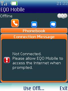
Heuristic: Help users recognize, diagnose, and recover from errors

Good: EQO does a decent job of informing the user they are in Offline Mode, even if the message does look a lot like an error...rather than a subtle or inviting entry to Offline Mode.

Pressing the Middle Selection Key (MSK) allows the user to "Use Offl[ine]". This doesn't result in another attempt to connect, rather defaults to EQO's central 'home screen.'

From the 'home screen,' the offline functionality is mostly as described in the EQO Mobile (Part 1) post.

Heuristic: Flexibility and efficiency of use

Good: The "Options" menu varies depending on which of the three features the user is in. This helps the user access the functions they need during the right context.

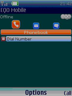
From the phone feature, the following options are available in Offline Mode:
  1. My Contacts
  2. EQO Status
  3. My Account
  4. Settings
  5. Exit
Pleasantly, each item is selectable in Offline Mode, and all but EQO Status provide unambiguous and useful feedback/function. My Account is particularly useful in Offline Mode, because it keeps a running tally of data usage, down to the Byte, for users who would like to keep track. (Although not necessarily Bad, this My Account screen is also where EQO has stuck the "About EQO Mobile:" information. I don't really see how this is related to My Account. Fortunately, this information is 'below the fold.' It's just slightly awkward though and doesn't really do any harm.)

Heuristic: Visibility of system status

Bad:
EQO Status is one of the 5 option items from the list. The user would likely expect EQO Status to show the current status of EQO. For some reason, this isn't what happens. Rather, the user is prompted to change the status of EQO from Offline to Online.

Selecting Online prompts the user to connect to the network again (done by the same Nokia prompt).

Selecting Minimize didn't seem to have any immediate affect. EQO, if you're still out there, please inform us as to what EQO Status is really intended to be doing...


Heuristic: User control and freedom

Good:
One of the Offline Mode settings is to change the default behavior back to the presumably more common use case of starting EQO in online mode. This saves the user from having to make that selection again each time, and implies EQO is keeping track of what the user wants. Starting in offline rather than online mode can really help the user manage connectivity issues, while maintaining control over when they really want to access the network.

For a data-conscious user, this flexibility should be nice. Once again, EQO has overall done a decent job of enabling Offline Mode usage. With a few UI tweaks here and there, this application wins...at least in Offline Mode.

More to come...

Labels: , ,

Offline Mode: designing for mobility

Mobility has tremendous, albeit obvious, advantages. However, these advantages come at a hidden cost—paid with devotion by mobile application creators.

Mobile applications are subject to a multitude of ‘hiccups’ during normal use cases.

For example
- incoming phone calls
-
inconsistent network coverage
- signal degradation
- limited battery life
- highly interrupted usage (mobile behavioral patterns)

Application creators need to design their applications to handle such interruptions (and elegantly recover from any of them).

To add to the challenges of mobile application use, network carriers tend to offer varied—and occasionally ambiguous—data consumption price packages. Often, this means users may have little understanding of how much money mobile application usage will cost them.

The combination of network data charges and interrupted usage suggests a mobile application should avoid network connectivity whenever possible.

Although a network connection like GPRS may be necessary for core tasks, an application's UI should try to offer as many functions as possible in an "offline" mode.

And so was born the UI Thread’s analyses of applications' Offline Mode…

Labels:

Monday, July 16, 2007

Giving Your Money to the Gas Pump

Years ago, gas stations made a big move towards efficiency when they began to encourage quick and easy payment options via electronic machines located near or on the pumps. This gets more customers through the station quicker and puts less stress on staff.

However, many of them threw usability out the window along with over-the-counter payment requirements.


A popular method of payment for gas these days is the credit card. While using mine, I instantly recognized the standardized swipe-slots with which to swipe my plastic. However, I ran into a problem when I couldn't find the screen that typically gives you instructions on what to perform next. I saw the big one at the top of the pump- that was easy to find. But it was a dedicated output only showing the cost and gallons!

The correct screen (indicated at the bottom-right of this picture) was not immediately recognized for several reasons:
  1. Proximity- the card swiper is not spatially beside the info screen that references it, as it should be.
  2. Visual Continuity- the card swiper and the info screen are visually separated by the vertical line created by the two panels of the interface. This creates a semi-conceptual barrier that subconsciously indicates non-relatedness.
  3. Most people are right-handed. Since the card swiper is on the left-hand side, it is easy to see that most people would actually stand to the left of the swiper in order to make the action of swiping easier. This means the person is standing even further away form the info screen! This problem is exacerbated even more when...
  4. The info screen has blinders on it! So, while it's not entirely apparent from the picture above, the blinders actually occlude most of the screen from the user's visual angle if he/she stands to the left!
While the interface actually has many aspects that could be improved for user experience, probably the most important is the function that it serves on the most very basic level- allow users to quickly and easily pay for their gasoline.

If I had to do a quick fix, I would remove the blinders from the info screen. These exist to shield the user's pin number from suspicious prying eyes. However, pumps are typically spaced out enough laterally so that it is already fairly difficult to see one's pin number being pressed. If paranoid, one may just as easily use their hand to block the number pad as they press it- at least they could find the info area right away in that case

But if we want to stay on the side of privacy and security, it would be best to either only have them around the number pad (specific to the function it serves), or to have them on the sides of the pump itself (general but non-intrusive). Both of these solutions would avoid falsely occluding features that don't need to be protecting from suspicious eyes. Hiding the info screen from the user seems like a dirty trick if you think about it long enough.


Lessons Learned:
  • Design for efficiency, but...
  • Keep input areas simple and intuitive
  • Make sure 'features' do not negate the usability of the product/service. They are better left out than invading the appropriate functional interaction...

Labels: , , ,

Sunday, July 8, 2007

EQO Mobile (part 1)

EQO Mobile is a J2ME application that allows you to use your data and local calling plan to make international calls. See EQO's How it Works page for details.

Version: 1.0.5
Phone: Nokia 6260

EQO's website recognized my phone as I visited their download page with my phone's mobile browser. That's a very nice thing, and expected in this day and age. I accessed the same mobile download page, get.eqo.com with my other phone and was prompted with a cumbersome selection flow. (I had to first select my manufacturer from a drop-down list, and then the model number from a loooong list of radio buttons, with no apparent way to skip to my specific model number.)

Heuristic: Visibility of System Status

Representation of System Status is extremely important in HCI. Users quickly become very frustrated and distrustful of a system that doesn't constantly show what it is doing. This is especially true for time-consuming interactions, or interactions that result in a critical outcome (such as deleting files, or making a data connection).

EQO seems to do some of this well, but some of it not as well.

Good
: The "Offline" text under the "EQO Mobile" header clearly lets me know I'm not online. The accompanying black & white 'offline' EQO logo to the right does the same thing.

Bad: I have no indication other than the fact that the Right Selection Key (RSK) says "Cancel" that anything is actually happening. The "Offline" text should change to "Connecting..." and there should be some kind of visual/graphical animated feedback. If there are any important distinctive stages in the EQO connection process, each stage should be represented by the text and animation.
Update July 10th, 2007
EQO Customer Evangelist, Chris, commented in reference to the "Bad" entry above. An excerpt from his comment follows.
"...you should see a "Connecting..." at the top of the screen when connecting"
I am happy to report I tested this with a Nokia 6233 to find Chris was correct. In fact, not only did the text update, but the EQO logo slowly blinked from gray to colored (to indicate the process of connecting). That turns the "Bad" into "Good" for the UI Thread.

There may be software bugs that prevented the text/icon being updated on the Nokia 6260, but the UI design seems to have been on par.

Thank you Chris and EQO for letting us know!
Good: Of the three top icons: the phone, the envelope, and the chat cloud, the phone is visually distinctive. This indicates I'm in the phone function, and maps to the sub-header, "Phonebook."

Bad: It's not really clear what I can do with the phone...especially if I'm offline and seem to be in the middle of an unknown operation.

Heuristic: Consistency and Standards

Consistency is a very solid design principle, enabling a UI to become intuitive and easy to navigate. Textual consistency--the mapping of labels to actions--is essential when building user's expectations about how the system will work.

Bad: Mobile UIs often use small icons corresponding to characters on the handset's keypad. In EQOs case, "#" is used as a supporting icon for "Dial Number." This doesn't actually correspond to the "#" on the keypad, and therefore goes against consistent standards.

This icon should have been incorporated into the object zone somehow, or not used at all. Perhaps even stylizing the icon so it didn't look like the standard keypad mapping icon would also improve on the problem.

Bad: The "Dial Number" object appears to be highlighted. However, there isn't a Selection Key (SK) that consistently maps to the action of dialing a number. The closest thing is the Right Selection Key (RSK) "Call."

It's quite unclear what this key would do, given the fact that no number has been entered.

Although not a consistency issue per se, it's also important to mention that "Options" should not be the most prominent default action in most cases. Let's see which options are available...

Heuristic: Efficiency of Use

A self-explanatory heuristic, Efficiency of Use is admittedly difficult to achieve on mobile devices. This is due, mostly in part, to limited screen space and potential many functions. EQO seems to have taken the easy way out of this challenging design problem, and put everything under an "Options" list.

Bad: "My Contacts" and "EQO Status" aren't truly options in the UI sense of the word. Options are usually settings related, or sometimes groups of actions. "My Account," "Settings" and "Exit" fit a bit better in this context.

"My Contacts" would seemingly be built in to the UI in the appropriate places, at the appropriate times. For example, during a call initiation interaction or message composing.

If EQO Status is what it sounds like it is, it should be obvious in the UI itself. (Once again, Visibility of System Status.)


A far worse example of breaking the Efficiency of Use heuristic is preventing simple navigation.

Users should never have to drill down into options menus for something as simple as backing up.

This touches on the Consistency and Standards heuristic again as well. Selecting "Back" actually brings the user back to the 'home page' of the Phonebook, which would show available contacts.
More to come...

Labels: , ,

Saturday, July 7, 2007

Welcome to the Initiation of The UI Thread!

The UI Thread is a manifestation of the thoughts and efforts of JD Moore and Cody Frew, two designers trained in the arts of user interface principles and interaction techniques.

Here, you will be able to experience our thoughts in the realm of consumer electronics, software interfaces, and other interesting interactive systems that may or may not by computer-related.

Our writings will come in 4 delicious flavors:

    1. In-depth heuristic evaluation
    2. Single feature discussion and redesign proposal
    3. Abstract thoughts on usability and/or design as found in the ‘real world’
    4. Rants on design methodology practices and their implications

We trust that by providing these 4 different types of content, you will be stimulated and engaged- no matter what your personal blog-style preference is!

It is our mission to learn all we can about technology and its utility in the mind of the human, as well as its context within culture. It is our hope that you, the reader, will learn as much- if not more- about the important topics we will address and share our passion for user-centered design.