EQO Mobile (part 3): Offline Mode
I noticed something peculiar when comparing two different EQO warning/error messages. One message was much better designed than the other.
Heuristic: Help users recognize, diagnose, and recover from errors
Bad: The first had a vague and technical reference to some mysterious error code "A0002."
Good: The second had a friendly and informative tone. "Please allow EQO Mobile to access the internet..." (by the way, EQO, 'internet' is a proper name and should be capitalized like so: 'Internet').
Despite the 'Bad' message, the real peculiarity was the 180-degree shift in tone. Who wrote the tone of the first message, and why was such a tone chosen? Was the author a software developer? Who authored the tone of the second message? Is it safe to assume they were different people because the messages were completely inconsistent? It surely seems so, as the two messages convey a completely different tone to the recipient.
 vs.
vs. 
Heuristic: Consistency
Bad: The aforementioned textual tone discrepancies are somewhat bad in terms of consistency. The difference in ambiguous/technical vs. friendly textual tones reduces the overall cohesiveness of the EQO error handling interactions.
Bad: On top of the textual tone discrepancy, I noticed another. Both messages are within the Phonebook and called "Connection Message." Each has a 'main' action available via the middle selection key and an 'ancillary' action available via the right selection key. So why does the position of "Exit" change from one screen to the other? There might be a good reason for this, but I am unable to presume it.
Heuristic: User control and freedom
EQO has chosen to develop their JAVA application with 2 keys in mind. I am using the application on a Nokia device with 3 keys, so the labels for the keys show up in the middle and on the right. Users of different phone manufacturers might find their selection key labels show up on just the left and right (as no middle selection key is actually available). EQO doesn't always have control of where their selection key labels show up, but when they do, they would be wise to take full advantage of keys. Why? Because limiting the selection keys limits the functionality of the application in Offline Mode (possibly limiting user satisfaction).
Case in point: when scrolling between the 3 core features of the application--Phonebook, Messages and IM Services--the right selection key completely disappears.
Phonebook: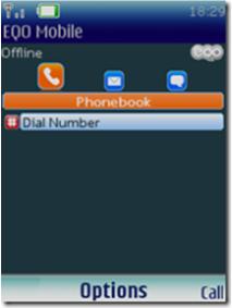
Messages:
IM Services:
Why isn't the most common user task 'bubbled up' to the 'main' action on the middle selection key and "Options" moved over to the ancillary spot on the right selection key (as we've seen in other examples of EQO UI)?
Labels: heuristic review, java, mobile
posted by jdmoore @ Sunday, September 16, 2007
103 Comments
![]()
![]()
